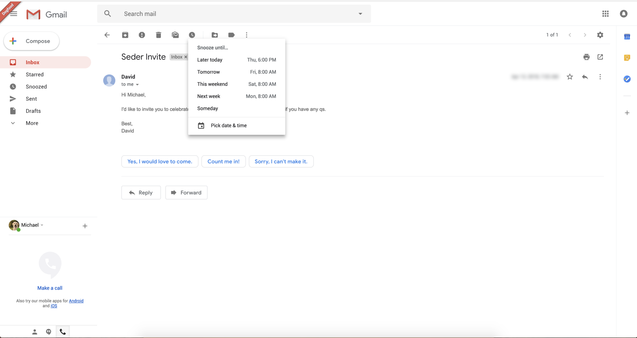
Google is planning to introduce a new Gmail design for Web. The design is expected to be rolled out in the upcoming weeks. The design will narrow down the gap between Gmail’s user interface on mobile and web. The new design screenshots are obtained by The Verge, which reveals some subtle additions to the Gmail design. A lot of new features have been added to the new Gmail web app bringing it in line with Gmail app on mobile. Following Google’s own Material design the new interface makes everything more round. The red compose button is now white with rounded corners and a colourful + icon.

Google is picking features from Gmail mobile app and adding them to the Web app. This makes the platform much more consistent and easy to use. Google is implementing Smart Replies feature for the web app. Smart replies will let you respond quickly to emails, based on the content. It gives you a list of suggestions to respond to an email using machine learning. The Snooze feature is also coming to Gmail for the web which will let you dismiss emails from your inbox for a certain period of time.
Google will also be introducing a sidebar on the right. This will allow users to quickly open Google calendar, Keep and Tasks without stepping out of the Gmail window. Also, you will be able to customize the sidebar to add fields according to your needs. You can add or remove apps from the sidebar, which will help you create a more personalized set of apps.
Moreover, Google has added three layout views that will allow users to choose how they want to get their emails displayed. The default setup will highlight attachments like documents and photos. Then there is a comfortable view that doesn’t highlight attachments. And last but not the least, a compact view which lets you slide in more messages in a single page.
Google’s I/O developer conference is due to start on 8th May in Mountain View. The new Gmail design is expected to be one of the announcements made in the conference.


