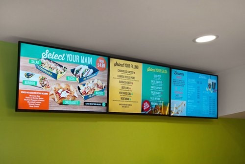
Content is the first thing you should plan when designing digital signage. Digital Signage is a marketing channel that relies on its visual appeal. Therefore, the way a given content appears on digital screens can make you win or lose your game.
In this article, we have five mind-blowing tips that will make your digital signs stand out from others.
Significance of Content on Digital Menu Boards:
No one can underestimate the power of branding in the success of a business. Branding is essentially how customers connect emotionally to your organization. Carefully designed digital menu boards essentially represent the brand guidelines. If you fail in doing so, the customers will not pay attention because the digital menu boards and advertising screens will appear irrelevant.
Use the organization’s latest logos, fonts, and brand colors to turn back your customers and prevent them from going to your competitors. Digital Signage providers can help you in making a more proper representation of your brand.
Less is More:
In the digital world, the less is more. There is a straightforward principle behind it. When we add everything good to a digital screen, it appears messy and cluttered. Yes, your eyes and brain get confused when there is a lot to see on a given digital display.
When they cannot figure out everything present on advertising screens, they get disinterested and look somewhere else, which is not good.
Trace your Target Audience:
No matter what content you place on your Digital Signage, it should be according to the target audience’s preferences. For an inspirational look, it is essential to complement the designs with the audience successfully. The place where you will place amped signs or digital display screens also determines the most appropriate content.
Consider the Font Sizes:
Digital Signage is a visual strategy for marketing and communication. It is essential that whatever content you are putting up on digital menu boards is visible to accomplish the job. If you are willing to display a creative on your digital, you need to fix it in an appropriate size.
Most of the time, the content is in text form. It contains headings, descriptions, body text, CTA (call to action). If the text is not readable, the audience will not get your message and will not complete the CTA as you desire. The distance of the digital signage and the consumer also determines the right font for visibility.
Don’t Forget the Call to Action:
Strong CTAs are fundamental for effective marketing. It helps the audience/ customers to know the way how an avail of your product or service. When a customer looks at a digital boards and menus without a CTA, he thinks “Seems, good,” or “I will try it” and walks away.
However, a marketing message accompanied by a CTA compels the customer to do something to connect with your practical business example practically. You put up a picture of your product with a description. Now, it is necessary to write something that fulfills CTA. “Grab this today and avail a 20% discount on all products for a week”.
The CTA must be clear and you should know your own strategy that how you will respond to your customers who are fulfilling the CTA.
The Final Verdict:
The text and visual content drive drivel signage towards its success and failure. Keeping things minimal is good. The digital menu boards and advertising screens must be clearly to your audience. And don’t forget to add a strong CTA.


